To create the look and feel of N++, we worked with legendary graphic designer MASA. We knew of his work because of this book, LATINO, which was another of the first graphic design books we ever purchased.
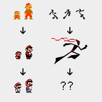
Designing the graphics for N++ was daunting — we wanted to refresh and evolve the graphics, similar to what happened in the Mario series, to incorporate the early 2000’s vector aesthetic we loved so much (as seen in the two previous books we’ve posted here and
here), AND to retain the minimalist hallmarks of the series:
MASA took it in stride, and added plenty of his signature bold colours and shapes, taking the aesthetic in a much more colourful direction than we’d anticipated liking. We knew we wanted to add more colour to N++ than the series has ever had, but we were thinking more about some slight variations on the grayscales of N and N+: MASA really opened our eyes to the possibilities, and it’s made the game much more vibrant and interesting as a result.
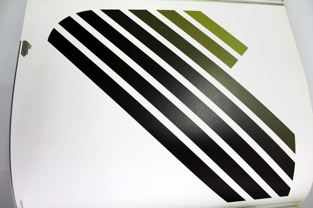
LATINO is a collection of the work of many artists, but MASA, who edited the book (as well as contributing some pieces of his own), had a great eye for connecting threads among them, featuring lots of bright colours and great use of typography:
The boldness of the shapes in the book seem endlessly useful for structuring UI and punchy menus:

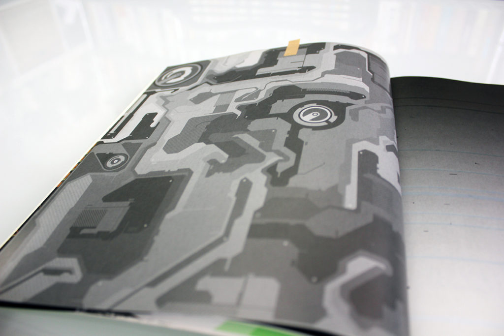
And for graphics as well — for example, here is a page we sent to the N+ concept artist:

Here’s yet another example of symbols and layout reminiscent of tDR’s work from that era, as mentioned last post:

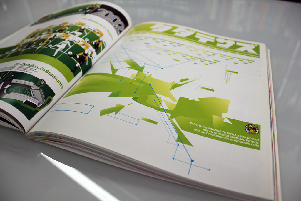
The book has plenty of great ideas for displaying vast amounts of information in interesting ways, like this one:

If you’re interested in making infographics, this could be a good resource.
Aside: that last image also contains some Japanese kana, which is another influential theme often explored by graphic designers that we may touch on in a later post. If you check our other posts about books, you’ll see more Japanese text pop up.
Bringing on a new collaborator to any project can be a challenge, since you first need to explain your vision to someone who can’t see inside your head. Good collaborations have a strong foundation of communication and understanding, but also respect for what each person brings to the table. Collaboration works best if there’s some fluidity to the end goal, instead of it being set in stone, so everyone can contribute.
What we loved most about working with MASA was how he took our direction for the aesthetic and really ran with it, bringing his own unique flair to the project and drawing everything together neatly. He challenged us to push our boundaries, and the result is something that really surpassed our expectations: even though the graphics in N++ are the most minimal of any game in the series, they have a brilliantly understated elegance and clarity that speaks to the quality of MASA’s work.
It’s safe to say that N++ is the most stylish platformer ever created, and a lot of the credit for that goes to MASA: he took what we wanted to do and elevated it using years of experience and a finely-honed eye. Working with experts can do a lot for your project!
He designed a really beautiful logo as well:
Gorgeous! This made it easy to then create marketing materials and merch because the logo is so distinct and clean. So, the right design can help everything else fall into place.
For all you devs out there looking for a concept artist with imagination and style, we highly recommend MASA. And get this book, it’s great (link below)!
///////////////////////////////////////////////////////////////////////////////////////
More info: https://shop.gestalten.com/latino.html
Buy the book HERE


comments ( 0 )