Wondering what inspired some of the colour schemes in N++, why we added colour at all, or how to add colour to your own game? We aim to help answer all of that in this series of posts, Introducing: Colour. This is Part Four!
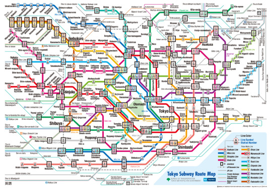
Coming from Toronto, we’re always blown away by how great the Tokyo transit system is – it’s fast, clean and covers the entire city pretty well. Plus, the convenience of Pasmo/Suica makes the whole system so easy to use. This is in stark contrast to the TTC, where you still can’t reliably use a card to buy fares, and traversing the entire (much smaller) city takes forever!
Anyway, this colour scheme was made during our stay in Tokyo in 2014, and was inspired by the Tokyo subway system. It’s a lovely soft gray (Hibiya), accented with pleasant gold (Yurakucho and Ginza), greens and blues (Namboku and Chiyoda). We cheated a bit and used some Toei lines – we just couldn’t resist the pink of the Oedo line for mines! We also tweaked the Mita line for exits, and used Marunouchi and Hanzomon in deathballs.
We’re going to try these colours on a white background also. And maybe we’ll have to make a colour scheme inspired by JR, too!
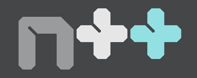
So you might have noticed a change in our colouring of the N++ logo lately. Here’s the logo we announced N++ with, way back in 2013:
But in 2014 we started using one using that delicious magenta instead:
It’s a reflection of our changing attitude about and confidence in this project – the first logo was much more calm, cautious. The new logo is in your face and more overt. It has a message to deliver, and it does so loudly and with style. We’ve touched on this before on this tumblr, but it speaks to how, as the game has grown, so have we as people.
At the beginning of this project, we were tentative, not sure what would be a good addition to the game, and not sure what would ruin it – and very afraid of that happening. We were in danger of letting our fears of making mistakes drive our decisions. But fortunately, we stayed strong (in part thanks to the forward-thinking people we’ve been collaborating with) and pushed out of our comfort zones, and over the past two years, we’ve been able to play with ideas, try different graphical styles, prototype different enemies, and overall explore all the options. Plenty of things didn’t work and were scrapped, plenty of wrenches got thrown in our plans, and we made lots of mistakes – but the difference is that we weren’t afraid of them anymore. When things went wrong, we learned why, and had gained an appreciation for that process. So now we have a better understanding of things that could and couldn’t work, and we’re able to move through the idea space much more quickly and confidently, and that’s reflected throughout the game itself, most visibly in our colour choices.
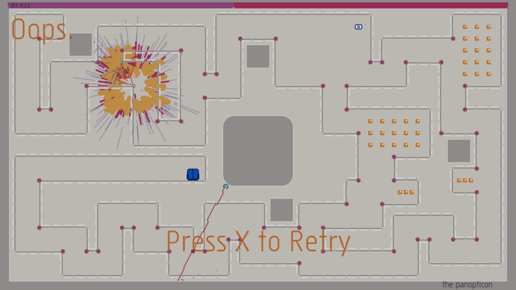
Hence, we’re now able to bring you this conceptual colour scheme (which will be unlocked later in the game) consisting of only three colours: pink, black and white. For comparison, the colour schemes in N++ you’ve seen up to this point generally use 20+ colours! And it’s a careful combination, too – hot pink and black can look a little déclassé and/or junior sometimes, but we think the large percentage of white in this scheme keeps it stylish, and futuristic. We may experiment and reverse the white and black as well, and see how that looks. But for now, this is a breakthrough colour scheme and a huge step in our journey to making N++ the best version of this game that could ever exist.
Oh yeah, we dream big over here 😉
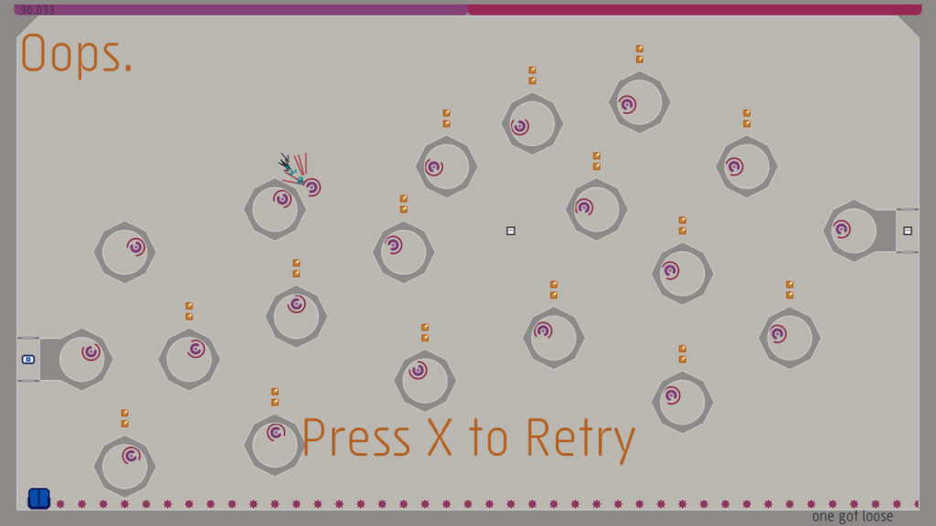
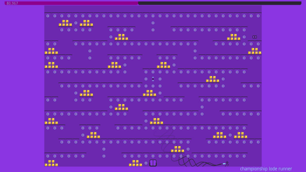
This colour scheme is a retina-scorching, neon wonderland. Actually, we can’t say for sure where the inspiration for this one came from, it just sort of sprung, fully-formed, from our heads, down through our finger bones and into Illustrator. It was a strange afternoon, but when it results in a blend of colours so energetic as to exude pure happiness, eh, you find a way to deal with it.
It calls to mind richly-hued purple wizard robes decorated with bright gold stars, and of course that weird eggplant wizard guy from Kid Icarus (and the late 1980s tv show Captain N). Evocative!
The best part of this scheme is the effects: the laser blasts, the gauss shot and of course the explosions. Those glorious explosions in bright pink and orange grab you by the eyeballs, and they don’t let go. ok this is a really weird post…But it’s a weird colour scheme, so maybe that’s fitting 🙂
//////////////////////////////////////////////////////////////////////////////////////////////////////////////
Next post, we continue to explore the colours and inspirations of N++. Coming soon!
We previously posted these on tumblr, but we’ve gotten so many questions about how the colours were designed in N++ that we decided to repost them here. Enjoy!







comments ( 0 )