Wondering what inspired some of the colour schemes in N++, why we added colour at all, or how to add colour to your own game? We aim to help answer all of that in this series of posts, Introducing: Colour. This is Part Two!
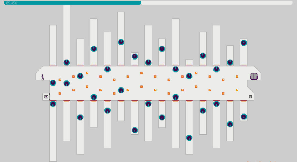
Ah, the clean grays of Pale, a colour scheme that lives up to its name if ever there was one. Pale has its roots in in the desire to make something that had a bit of a construction vibe, which morphed a little when we came across this image: https://i.kinja-img.com/gawker-media/image/upload/s–o_14QrJ4–/c_fit,fl_progressive,q_80,w_636/19eyscnw5029xjpg.jpg and really liked the colours. We’ll revisit that idea again, since this scheme doesn’t really reflect the bold black and orange stripes we think of when we think of construction. But such it is with inspiration; this one is ok too.
The best part of this colour scheme is the explosions. This skin was the first in which we were really aware of what the explosions add to the game. If you go back to the previous post in this series and take a look at Vasquez, you can see that the explosion colours in that skin are variants of the tile colours, so they fit, but don’t draw too much focus. In Vasquez the colours do the job, but in Pale they really shine. The explosions are eye-catching, dynamic and beautiful. And they’re even better in motion:
Those bouncing particles!
Anyway this newfound insight about the impact of the visual effects gave us the courage we needed to really go for it with explosions, as you’ll see.
Let’s quickly compare some colours so we can get deeper into the design behind them. Here’s a roundup of the colours that start unlocked in N++, aka the ones you know and love 😉
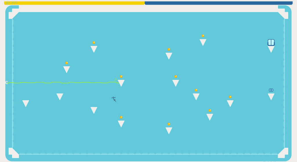
Composed of a nice medium blue, some light light gray, and a bright white outline, this scheme is very easy on the eyes. It was the first that was a major departure from N and N+ colours that was unanimously favourable to the entire dev team. On others, opinions are split, but this one captured all of our hearts.
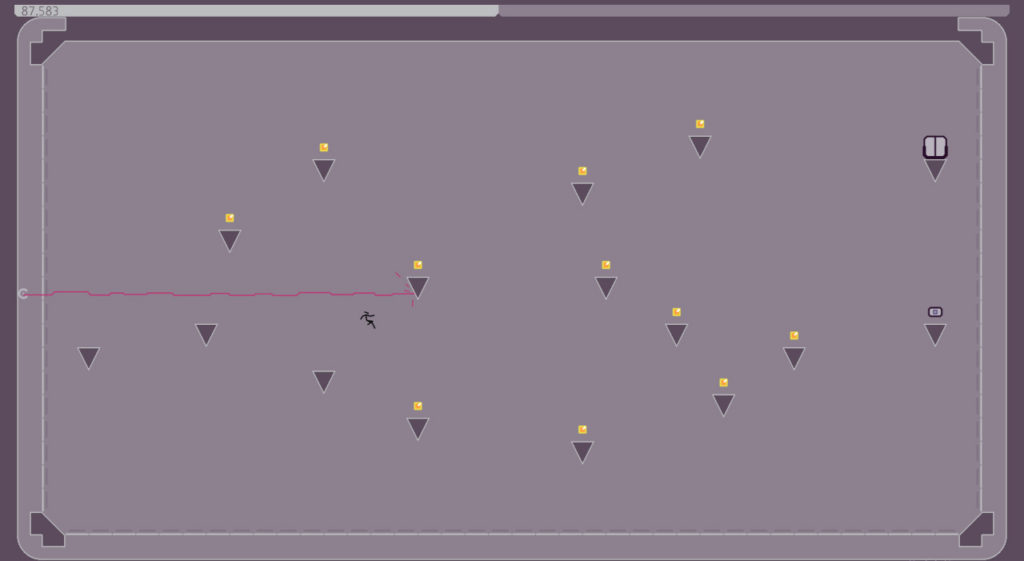
These purples are slightly more desaturated than we’re used to, and are meant to reflect that time before it gets dark when the world is awash in a strange diffused light. It draws from only a few colour families, with a burst of pink here and there to keep things interesting. As we progress, you’ll see we return to the pink family a lot – there’s something about various shades of pink that work really well with so many of our colour schemes. It’s the perfect punctuation mark.
Named for the hot pink, of course. The sort of salmon background is meant to calm the hot pink tile colour. We tried this colour scheme with and without the orange tile outline – without, it’s too sedate, somehow. That orange gives it life. We love the contrast with dark red, and turquoise on this scheme is just delightful. As we’ve mentioned before, this is one of the brightest skins in N++, and it wears that badge with pride.
We’d been tossing this idea around since N+, actually, but never found a way to make it work until the tile outline was conceived. It really opens up the possibilities for colours and concepts, as you’ll see especially in Round Two. Retro is an homage to video games past, from Donkey Kong and Pac-Man to Asteroids and Space Invaders. These are the games of our youths, the games that kept us playing, quarter after frustrating quarter, the games that broke ground and inspired legions of developers, and which paved the way for games like N++ to exist at all.
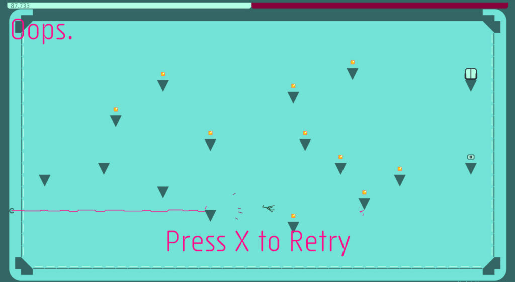
Named for the Roman god of the sea, rather than the planet, Neptune is a delicious bridge between teal and turquoise that reminds us of the Atlantic. The gold glitters like treasure at the bottom of the sea. Once again we break up the green with a punchy pink – it goes with everything!
Design Notes
Now let’s take a moment to dig into colour scheme design, by examining the prevalence of pink, or more broadly, the prevalence of a bright, high-contrast, saturated colour. Each skin generally has one, a colour that really stands out from the rest. It draws your eye to certain information, from an especially dangerous enemy to useful UI text. As discussed in past weeks, it’s important for players to know what they can touch and what they should avoid very quickly when playing N++, and this is one way we scaffold that knowledge.
We still have a fondness for the functional dependability of the colours from N and N+: we love gray, especially in the form of smooth concrete, to which the colours in N most definitely allude. It seems like only yesterday we were terrified of ruining the game with too much colour, or colours that were too visually oppressive…but now that we’ve learned how to maneuver in this more colourful space, it’s not scary anymore, it’s exciting.
As we’ve briefly discussed before, we’ve noticed that colour can affect your mood as you play N++. And what we’re also noticing now is that the colour schemes we create seem to be linked to, or perhaps even dependent on, our moods. It’s possible that the very fact that so many colour schemes are punctuated with brightness is a reflection of our mental states: you can see our enthusiasm and renewed excitement for N++ in those vibrant colours.
A bright and distinct occasional colour provides a break from monotony – or monochromy, as it were – keeping the eye moving and the brain from getting bored. Too much bright colour and your eyes get overstimulated and tired (so, we’re also working on some more tranquil colour schemes), but just enough, in just the right places, and that brightness ripples through to enhance the impact of all the colours. We’re experimenting with that phenomenon still, so as we progress through the new colours you’ll see more manipulation of those punchy pinks and bright blues.
//////////////////////////////////////////////////////////////////////////////////////////////////////////////
Next post, we continue to explore some more colours and inspirations. Get excited!
We previously posted these on tumblr, but we’ve gotten so many questions about how the colours were designed in N++ that we decided to repost them here. Enjoy!


I thought that maybe I should be the first comment, just so I could feel like I’ve accomplished something. Love the games Metanet, and while I’m sad that N is over now, I’m excited to see what’s in store!