Wondering what inspired some of the colour schemes in N++, why we added colour at all, or how to add colour to your own game? We aim to help answer all of that in this series of posts, Introducing: Colour. This is Part Five!
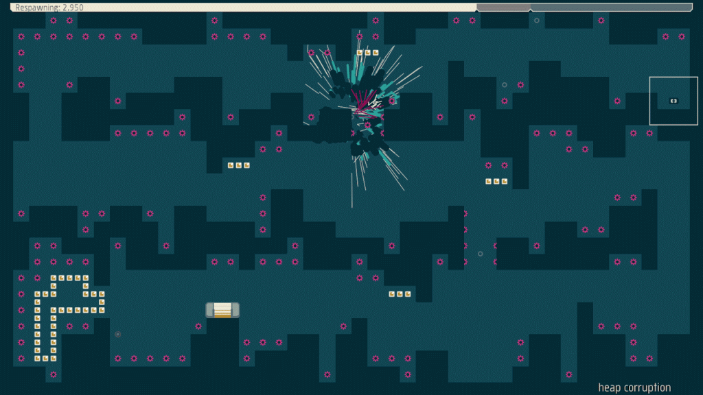
This is Poseidon, the sister colour scheme of Neptune. How they were named is probably obvious, but just in case, Poseidon is the Greek God of the sea, and Neptune is the Roman equivalent – and the colour schemes are variations on a lovely sea blue-green. With a dash of hot pink and some spectacular explosions, natch. Gods probably have a lot of swagger, we figure 😉
Poseidon is kind of the inverse of Neptune, dark in the background and light in the foreground where Neptune is light in the back and dark in the front. Wikipedia says Poseidon is sometimes referred to as “Earth-Shaker” or “tamer of horses”, which coincidentally totally describes this colour scheme as well. Convenient!
Introducing: Supernavy, Dorado, Pulse and Shift


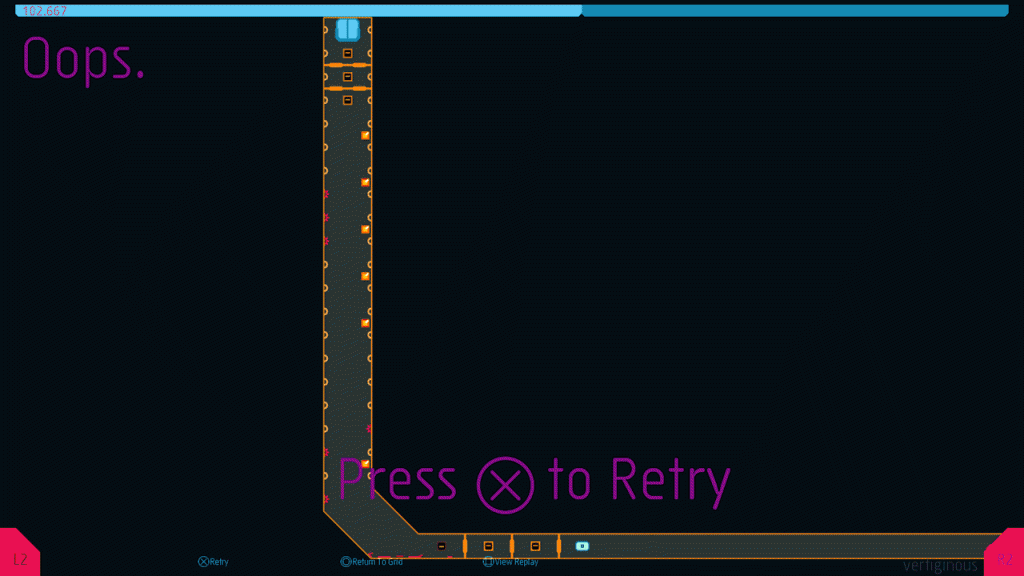
The four screenshots from N++ above are all made using the same colour palette. We started by making the orange one, tuning all the entities and details so they fit with the orange tiles. Then we decided that a black background with bright orange tile outline could look really cool so we tried that. Then we experimented with navy and gray and – well, they all looked good enough that we decided to put them all in!
The inspiration for all four of these colour schemes is the last picture above, from an airport luggage scanning x-ray machine. We see these machines a lot in our travels and have always loved the interesting colour choices and how they overlap. It’s also a nod to Narita Inspected, one of our favourite design books (made by one of our favourite design studios, Büro Destruct — look for a post on their books soon!). Narita Inspected was one of the first design books that we ever bought, way back in 2001 – it’s an important part of the foundation of both our design library and our design aesthetic. We’ll do a feature on this book soon. In the meantime, we highly recommend picking it up!
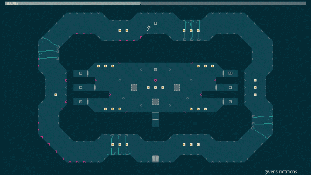
This N++ colour scheme is all about those fleeting moments when you’re walking around at night in a busy city and unexpectedly find yourself totally alone, even just for a minute. It’s quiet, calm and full of depth, with nuanced whites and deep, rich blues. Cities are like living, breathing entities, and it’s interesting to feel how they differ in subtle and intriguing ways.
One thing we noticed in Tokyo is that those moments of solitude, of being completely, utterly alone, are few and far between. In a city as large and dense as Tokyo is, it’s very rare that there isn’t at least one person taking the same road as you are, or shopping for the same item you are. Even at night, when many are indoors or asleep, enough people live in Tokyo that there are always plenty still walking around outside.
Tokyo is in stark contrast to Toronto, where we can walk for many minutes occasionally and not run into another pedestrian, and where sometimes even the most common of supermarket items can be shopped for solo. The differences between the atmospheres of each city shape how we appreciate these spaces and environments as we explore them, and shape how our memories about them are formed. Being in Tokyo changes how we define our little bubbles of personal space in a way that persists long after we’ve left the city.
You may wonder why we’re going on about this seemingly weird trivial thing – it’s because this is the sort of thing that connects our emotions with our perceptions of reality and makes them more than just a series of disconnected spaces and experiences. These tiny details impart meaning to our memories, and influence who we are as people. As game designers who try to create spaces and experiences, it is an important thing to ponder: even something as subtle as the number of people you meet walking down a busy street, or the colour of the streets at dusk can greatly affect the emotional response you have to that experience. Imagine how affective something less subtle could be, and how we can cultivate a vibe or flavour from a chain of those tiny emotional responses! As a wonderful bonus, each player’s particular experience of a game is customized personally to them, filtered through their own emotions and memories – although we can create a structure or foundation for a game world, ultimately it is filled in and completed by each player.
In a less abstract game, this makes each world or city or environment feel real and distinct. It’s tough to do that in a minimal and abstract game like N++, but it’s important to try: the game would feel very monotonous if every level had the same vibe and the same feel – hence, using various tile shapes we try to make some levels that feel claustrophobic, and some that feel vast and expansive, some that feel like caverns and some that feel like skyscrapers; that distinct flavour is further teased out in colour schemes like Evening.
Making games is all about capturing the magic and variety of the world around us, translating our experiences into the game world, so that you as a player feel compelled to explore.
//////////////////////////////////////////////////////////////////////////////////////////////////////////////
That’s it for Introducing: Colour for now, but we will probably return to this series, it was a lot of fun to write. If there’s a specific colour scheme you want us to cover in future, please let us know!
We previously posted these on tumblr, but we’ve gotten so many questions about how the colours were designed in N++ that we decided to repost them here. Enjoy!


Man, nothing on F7200?
Or heck, Oceonographer and m?
Glad you’re finding the series enjoyable! There are so many colour schemes in N++, it was hard to choose what to cover for these posts, but we decided to start with the colours most people would see as they play, hoping to get them excited about colour and design. Sounds like it’s working so far 😉
Thanks for your suggestions, we’ll definitely keep those in mind for future posts!
F7200 is one of my favourites, because the yellow and light grey remind me of my favourite Lego Technic set I had when I was a kid. Given that playing with that was a creative act, it sort of feeds forwards into my activities with the game and inspires me. I like to use it when designing levels 🙂
@sendy: awesome! We had never considered that angle before. (I only had a couple technics sets IIRC). p.s – thanks so much for your awesome steam review, really insightful!! 🙂