Wondering what inspired some of the colour schemes in N++, why we added colour at all, or how to add colour to your own game? We aim to help answer all of that in this series of posts, Introducing: Colour. This is Part Three!
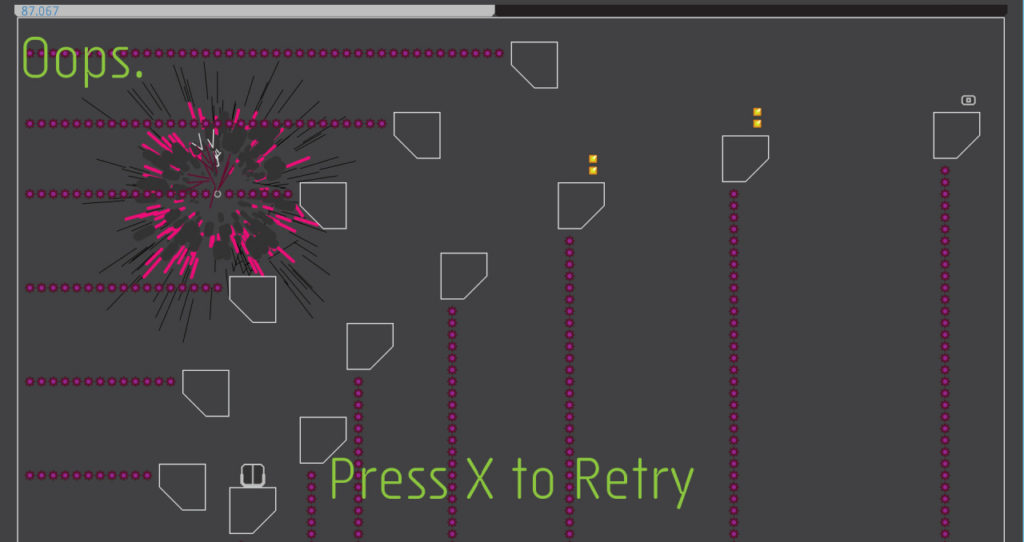
This colour scheme was made while we were in Tokyo in 2014, and is a sister to Retro and Mono, which are very simple colour schemes focusing on black and white, and outlines. This one obviously focuses on gray, but as you may know we are quite familiar with gray in the world of N and N+. N++ will have its share of gray colour schemes as well, as you’ll see in the coming posts, so for Party, we try to create a unique personality and distinct feel using some juicy, saturated colours.
We called it Party because it feels like a notable event: it’s bright, cheerful and lively. But the best part of Party is that beautiful medium gray: it goes with everything!
Fun fact: part of the inspiration for this colour scheme was one of Metanet’s corporate fat-cats, Megatron (pictured above, snoozing by the window) – she’s a gray striped tabby and likes to sleep in the sun by the plants. While we’re away from the office, we really miss the cats, so in Tokyo, this image came to mind, inspiring us to make a colour scheme featuring dark gray (Megatron’s stripes) with bright greens and pinks (plants/flowers). N++, brought to you in part by: cats!
Introducing: Acid

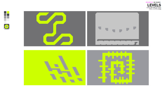
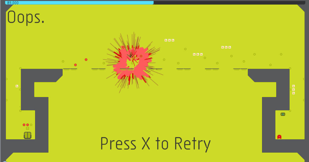
This is Acid. This was one of the very first ideas for a colour scheme we started playing around with, and was suggested by MASA in one of the first proposals he put together for us (below).
As previously mentioned, we were hesitant about colour in the initial phases of N++. We knew we wanted to make the game more colourful, and to make screenshots that looked inviting and intriguing, but we didn’t want to ruin the game with too much crazy in-your-face colour that would distract players from the gameplay and ultimately cause them to play worse. We were open to gray and yellow because we’d previously experimented with yellow in N+.
So we thought including yellow would be a nice callback to N++, but we wanted to change up the tone of that yellow to progress from N+ to N++, and signify that N++ is new, different, electric and exciting. We experimented with a variety of acidic, fluorescent yellows and greens, and eventually settled on a sedated but still very bright greenish-yellow.
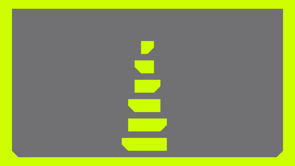
We loved MASA’s initial proposal and the screenshots we generated inspired by that palette (as above), but as we brought those ideas into the game and started to expand them to include all the enemy colours, gold and other entities in the game (with the help of the intrepid Lisa Harrison), we hit several walls. There were very few options that worked with that yellow; we either lost readability or style.
But then during our stay in Tokyo in September, we were watching tv, as you do, and the weather report used the exact greenish-yellow we were working with to depict a typhoon over Japan, showing the rain and wind with a few shades of turquoise and blue, and the path it was to take with tomato red and pink. It was the variety we were looking for, plus the style we needed, and the slight desaturation of the colours was easy on the eyes. Perfect! And so, Acid was finished.
Introducing: Orbit
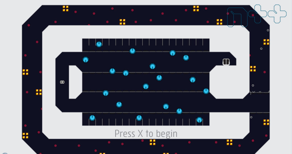
Now let’s stare into the abyss of space, with Orbit.
We considered naming this one VonBraun (System Shock and System Shock 2 are some of our favourite games), but ultimately went with something more evocative.
This colour scheme was devised with science fiction in mind, and reminds us of a space station with plenty of windows slowly orbiting the planets of an inky galaxy. It’s meant to evoke a mood, and to highlight the sci-fi minimalist aesthetic of the game world without being too literal. The tile foreground colour is what we call ‘sci-fi white’ (ie. a really light gray) and the background colour is deep navy, almost black. Entities are coloured like stars, galaxies and beacon lights, warming the environment slightly so players don’t feel so terribly alone.
As you can see, this scheme is rare in emphasizing the negative space (the tile background, which is navy here) over the positive (foreground; light gray) – until this point, we typically had made the background light and the foreground darker. From a design perspective, we don’t want our quest for new colour schemes to become like an arms race, where in order to make colour schemes feel different, we must always make the colours brighter or the combinations weirder. That would be an easy way to ruin the game with ugly colour schemes that are hard to read! So this is a way for us to add variety to the colour schemes without sacrificing appealing aesthetics.
//////////////////////////////////////////////////////////////////////////////////////////////////////////////
Next post, we delve into a few more colours and inspirations. Get ready!
We previously posted these on tumblr, but we’ve gotten so many questions about how the colours were designed in N++ that we decided to repost them here. Enjoy!





Where i can get songs?
https://www.youtube.com/watch?v=Z-zJIaaTZhM
https://www.youtube.com/watch?v=Bo2lsAT12QU
https://www.youtube.com/watch?v=dKr-hO28L-M
P.S.
I want to say, What will be in 2017? Or in October, December?
@LimeKenzo: in the trailer we made (your first link), the music is by Raigan. you can find more of Raigan’s music here: https://soundcloud.com/operator-operator-7
We didn’t make those other trailers, so we have no idea.
What’s coming in the future? Surprises!
I really like a lot of these colour schemes. Will there ever be a way to officially or unofficially create our own colour schemes? I have lots of ideas!
BTW, I am uploading my second runthrough of the game to Youtube (just the demo replays), and I am chosing a colour scheme for each episode that I think best suits it. You might enjoy it, though there’s a lot of footage (I recommend x2 speed).
https://www.youtube.com/playlist?list=PL1NVQHwmNfEHlY14TEpvXPEgPbUWDH__x
I mean. Song name
@Sendy Thanks! there are more on the way with the new levels, too 🙂 About custom colours — they’re extremely complex, requiring about 200 choices and a ton of testing and tweaking. We may do a contesque, where players mock up a few screenshots and we pick a/some winner(s), but because of the complexity and the UI nightmare that would ensue, player-made custom colours are unlikely. So we’re hoping to have enough choice for you built right in 🙂
Awesome. May I suggest a decent hell-ish themed scheme with deep, pure reds, a scheme with a nice pure deep blue and purlpe (these are my favourite colours), and perhaps a scheme inspired by the Commodore 64’s 16 colour palette? Also, more green, I really love the green in Meteoro 🙂
New levels, amazing, can’t wait. Though I’m getting a ton of mileage out of the existing ones, trying to get as much gold as possible. I’m noticing a lot of subtleties, like how the mine fields are laid out to have a safe slow route and a much faster but more dangerous quick route.
Thanks Sendy! We think you’ll really like some of the colour schemes in the next batch 🙂 Super glad you’re enjoying the levels so far — and that you can see some of the little details in them! That’s so good to hear 🙂
Thank you for going over your thoughts while making some of these color schemes with the Colour posts, it’s very nice and inspiring to see that a good amount of the color schemes in N++ aren’t just a bunch of colors that look nice together, but also have stories/reasoning attached to them (not that the latter is required, but it’s certainly cool to see). c: